Right here! Click the yellow button below to download DIN Time 2.63.
Download DIN_Time_263.pbw (245.8 KB)Can you add support for Celsius/Fahrenheit?
It’s already there. Open the settings page (through the Pebble app) and tap the orange circle over the weather icons in the preview image. In the popup that appears you will find a setting for the temperature scale, amongst other things.
IN
What does the arrow under the temperature indicate?
It’s the current barometric pressure trend; rising, steady, or falling. Generally, if it is pointing up the weather will improve. If it’s pointing down it will get worse.
IN
Can you add support for getting weather data from Weather Underground, Openweathermap, Forecast.io, YR.no…?
At the moment I’m not working on adding support for other weather providers. But It’s on my long-term todo list. Unfortunately it’s not as as easy as just switching the provider. The weather icons needs to be adapted to the different providers, for example.
IN
How do I read the weather information?
The top box is current weather. To the side of that is the current temperature. Under the temperature is the current barometric pressure trend (see above). The lower, dashed box is the forecast for the rest of the day with the expected high (top) and low (bottom) temperatures. This description is for a rectangular Pebble. If you have a Round it will be different, but the general idea is the same.
IN
Does DIN Time have a big impact on the battery life of my Pebble?
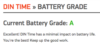
DIN Time periodically updates the weather (if set) and that will consume some more power than watch faces without weather. If it is set to update more often, every 30 minutes, the impact on the battery will of course be larger than if set to every 60 minutes. Enabling seconds will also draw considerately more power than when disabled. All that said, according to the statistics available to Pebble developers, DIN Time has been given a battery grade of A. See below.

IN
Does “DIN” mean anything?
Yes, Deutsches Institut für Normung. It’s the German Standards Institute. They developed the typeface DIN Time is based upon. The typeface was used for road and highway signage. The design of DIN Time was also originally inspired by these highway signs, but more so on the Pebble. Some elements has been removed for the Fitbit version. You can still see traces though, like the naming of one of the themes, Autobahn. The dashed line around the forecast is another thing. On highway signs a dashed box around a road number shows that the current road or exit leads to that road, ie. what’s coming -> forecast. Pretty far fetched, but I like it.
IN